I wanted to do a personal photo-story that dealt with the difficult subject of childhood trauma and how it affected me well into my adult life. I wanted to specifically look at the story from the angle of adult psychotherapy counselling and how I eventually came through those experiences.
I need to contact my tutor first of all. This assignment is to be negotiated as if it were a client/photographer relationship.
Update 05 August:
Phew, I got the green light from my tutor on this subject saying that he has every confidence in my ability to produce this work with the caution that the images that I want to make may be harder in reality to pull off. I've also given myself a get out clause of scrapping the whole assignment and starting again if necessary.
I began like I always do by making some sketches in my notebook and adding to them as the day and weeks pass. I will need a lot of props for my constructed images so I made a list and looked on eBay and in charity shops for the items I will need. So far my list includes:
- a pair of mens slippers (tartan or check design)
- 20 beer bottles
- a cheap looking plastic flower in a holder
- a box of tissues
- a length of plastic vacuum hose
- a scanned polaroid photograph of my father
Update: 10th August
Some of my sketches are really coming together and I've had some new ideas and updated or changed others. I've managed to get hold of the vacuum cleaner hose quite cheaply from an Amazon seller and a hideous blue rug that will be used to represent office carpeting.

The plastic flower was 50p from a jumble shop in town. In case you were wondering I was looking for the tackiest one I could find.

These items are to be used to put together a couple of scenes that I wanted to re-create in a psychotherapy counselling room. I had to move all the furniture in my guest room to one side and take the bed apart so I had a clear corner to set up. I put my blue rug down and arranged a chair, a small table and some other props. I put my camera on a tripod and used its interval timer feature and just kept experimenting until I had the image I was looking for. This involved several stops and starts and I assessed the work on my computer and then went back for a re-take.


Here are my final images. Note how I remembered to change clothes to indicate different sessions:


Upate 12-15th August:
The OCA Flickr group has set a challenge for us students. The idea is to create an image on the theme of 'The Nearest Faraway Place.' We are going to each make an image and attach it, concertina style, to one made by the previous student. The concertina of images is to be passed along the chain of artists around the world until it reaches the OCA headquarters.
Although not initially part of this assignment I realised that the image I have in mind would sit very well with what I am doing here. The majority of my work is interlinked and deals with similar themes anyway. My inclination for the challenge was to make an image of my bed. I wanted to take this idea further and create a sort of dream image to encapsulate the notion of a faraway place. The idea then spurred me on to re-create one of my favourite paintings "The Dream, 1910" by Henri Rousseau.

For my interpretation to work I needed to learn how to make Origami flowers. I've found a website that had videos on how to make them. I printed out some sheets of A4 paper with my "Looking out as a boy, looking in as a man," poem repeated across the page. If you want to read some background on the poem and the original work it was created for I've written about the images in my People and Place blog post here:
PaP blog post about my Untitled gallery work
The poem itself isn't referred to in the blog post or on the Untitled website where the images first appeared as a sequence. I was a bit self conscious about providing too much personal detail at the time and was happy for the images to stand alone and have a bit of ambiguity about them. I subsequently put the images into a Blurb book and included the poem. I've reproduced it here in case anyone wonders what the text is on the Origami flowers in the image:
Looking out as a Boy, Looking in as a Man.
Looking out as a boy
hands on a ledge
20th August 1976.
Growing out of the dark
to soak up the sun.
Looking in as a man,
curtains caught in the wind,
to find places that sing.
Setting up the bed for "the dream" image has taken all day. I arranged the bedding how I thought it should look to represent sky and jungle and used some OCA badges as place markers as I haven't made the Origami flowers yet. I made quite a few adjustments to positions of objects as even folds and creases in the bedding made a big difference to the final look of the image. I put the pillows into place to represent the sky and as a contrast to the paper sun - the contrast between them is quite good.


The origami birds and flowers are ready. The birds are for a different image.


Update 17-18th August:
One of my new ideas was to make a spiders web. I did a google search and found some sites that had instructions on how to make the sort of thing I was looking for. The webs are made from strips of paper with my poem printed on them. Once it was dry I blue tacked it to the window of my bathroom and took some test shots so that I could see how the web looked in an image and made some adjustments.

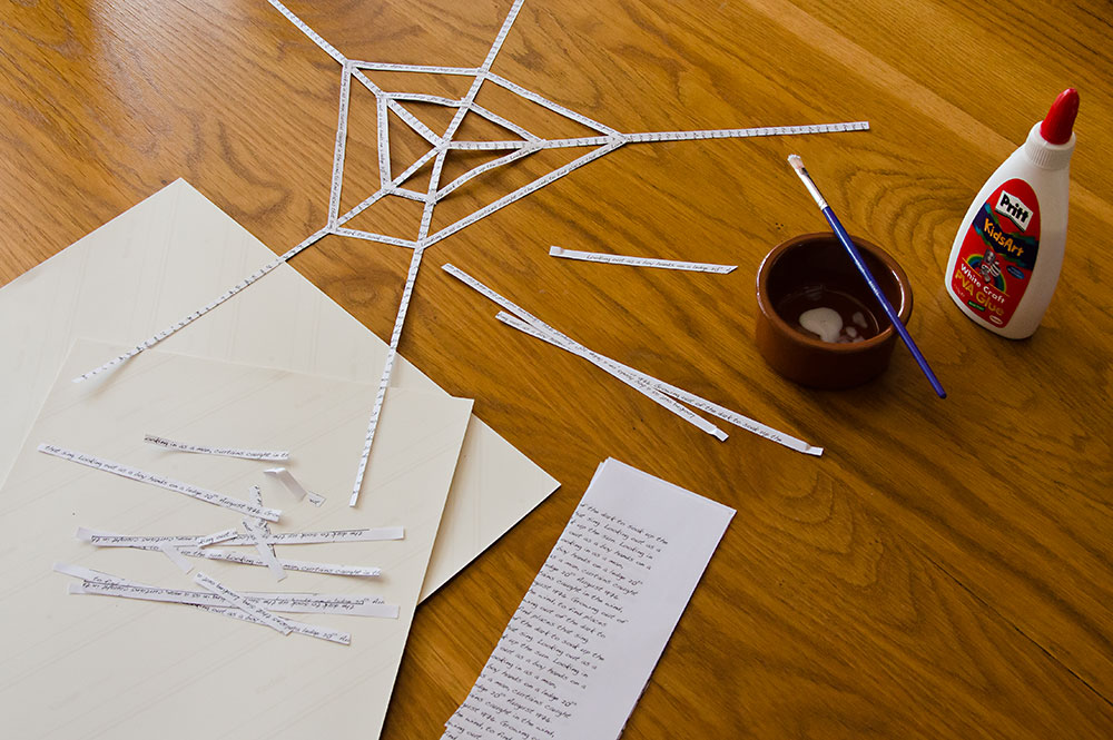
My finished image:

Update 19-25th August:
I spent ages and ages soaking the beer bottles to get the labels off. A bit of a pain but I need to do this to get my images right. I have four images in mind. Two using the beer bottles without the labels and two just using the labels themselves. The carton of beer only came to eight quid but I'll be using them in four images so I think I got my moneys worth.


My final image:

All my pre-planning has worked out really well and my images are coming together fast - almost one a day! This is what I've worked on today. I put copy of a photograph of my dad inside a beer bottle. I did a test run to see if the printer ink would run - after a couple of hours the liquid was still clear.

The beer bottle would be going inside the fridge. A tripod was needed and some re-arrangements to the shelves. To make my constructed image I also needed some snack food to go in the fridge too.


Luckily I had to pop out in the morning to do some library research for amendments I'm making to assignment 1. This gave me the opportunity to pick up a muffin from Neros. This is the evidence from after the shoot!

My final image:

Today's shoot is taking place in my en-suite shower room. The space is a bit tight and can just about manage my tripod and camera with my 18-200 lens. The 18mm focal length is a godsend in this environment. The plan is to shred the labels that I previously removed from the beer bottles. The bits of labels are a metaphor for washing away the past.


I also conceived of an accompanying image that would show pieces of label after drying myself with a towel. I did a couple of test shots with a white and orange towel to check which would look best with the labels and sit well with the cubicle shot on a spread.


For the cubicle shot I placed a towel on the floor by the shower tray and used the shower hose to make the interior wet. I then removed my socks and stood inside so that when I re-emerged I could stand on the towel and leave two wet footprints - something I've observed many times and noted would be of use, visually, one day. I also threw pieces of label into the shower so that they would stick to the wet tiles.
My camera was already set up so I took a few exposure shots and checked the composition. The labels looked too uniform so I sprayed some more water to make them swirl about in a more natural way and ensured that most of the labels would be around the plughole as you might expect.
My final images:


Update 27th-30th August:
This is a pre-planned image I had in mind for quite a while. The image represents flashbacks to childhood events. The finished version looks a bit Crewdsonesque.

A test shot to plan where to stand and also a check for annoying details. My reflection in the microwave is removed in the final image.

My final image:

A self portrait.

My final image:

I constructed a mobile to hang the origami birds from and then did some test shots to check DOF.


My final image:

Update 31st August:
I have all my staged images now. I just need a shot of the exterior of the counselling centre where I went for my sessions. Once I have that it will be on to making layouts for the photo-story spreads.
Update 3rd September:
My spreads have returned from the online printers. I'm mostly happy with how they came out. I will make a few changes for assessment though. I never seem to get my printing quite right first time. I definitely need more experience with this. I'm thinking of taking a course just to firm up my knowledge. Here are the spreads in the correct sequence order. I think they came out all right in the end. The accompanying assignment essay is also completed so it all needs to be packed up and sent off to my tutor today.


Update: 3rd October.
I received my feedback for this assignment a couple of days ago. It was VERY encouraging. That is a good feeling to have and I can definitely feel myself becoming more confident with my work as the last two modules have progressed. There are no suggestions for changes although I do want to tweak the processing in a couple of images that aren't quite how I want them to look. I'm also attending a Printspace post-processing and printing course next month so that should iron out any issues with my methods.
I was given a weblink to research regarding the historic FSA images and how they have been re-evaluated over time. I mentioned the FSA in my research notes submitted with my assignment images. I will follow that up in a couple of days and then update back here.
Update: 17th Febuary.
My review of the recommended book, 'Killed: Rejected Images of The Farm Security Administration' can be read here.


